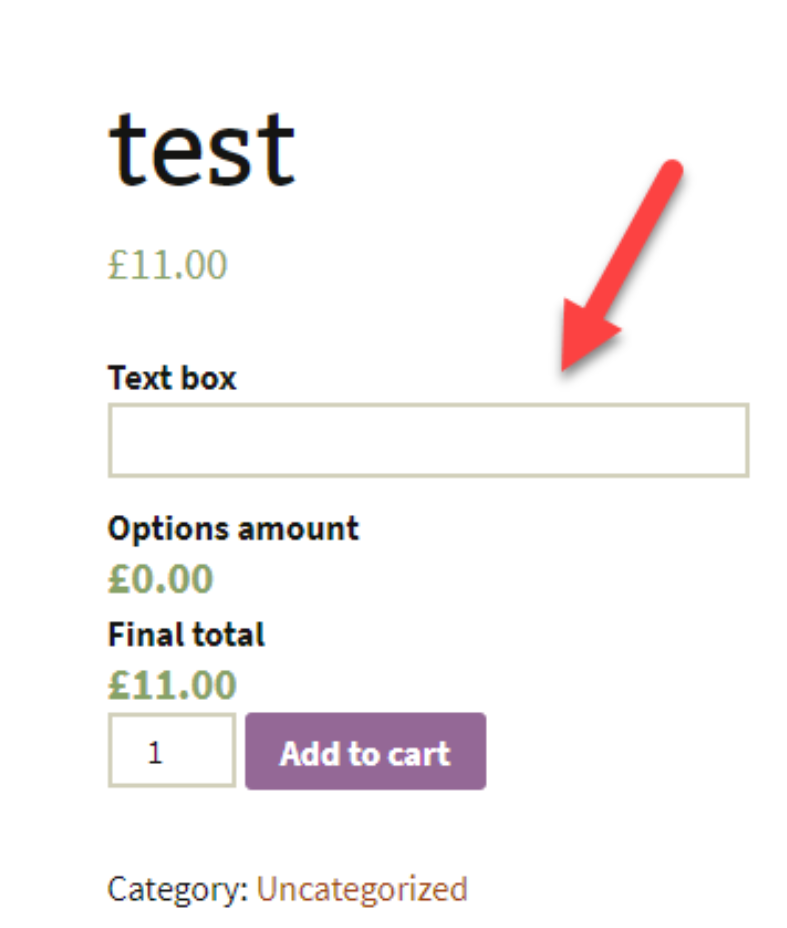
Text Box
Adds a text box to the product
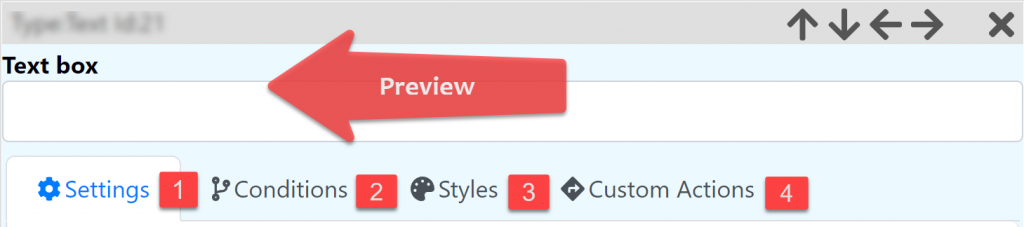
Settings
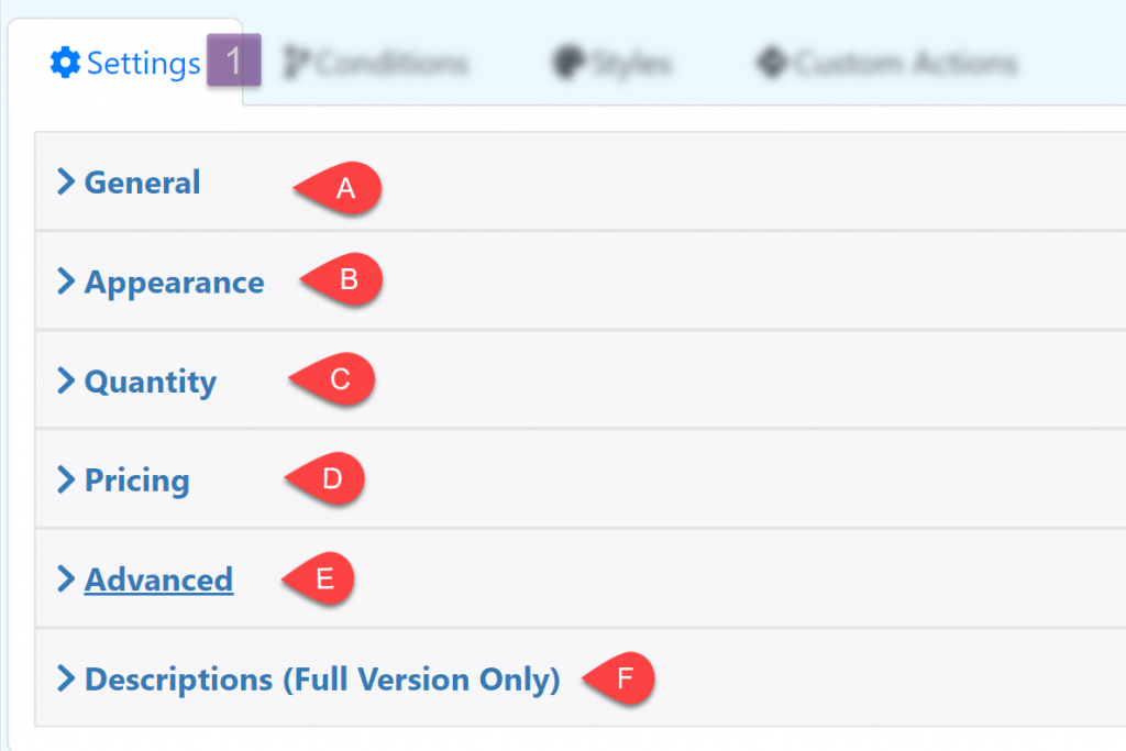
General
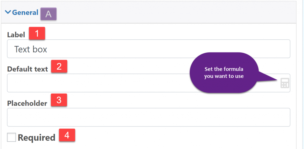
Label: The text at the top of the input box
Default text: Text inside the input box
Placeholder: Text inside the input box, this text is removed when the user use the input box.
Required: Make the field required
Appearance
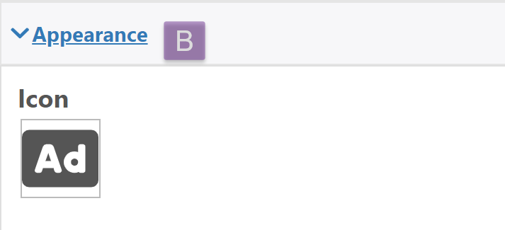
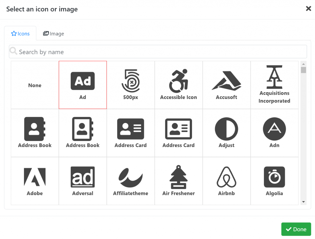
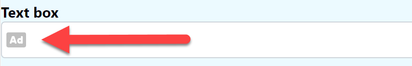
Icon: choose from a wide variety of icons or upload your own image from your gallery, this icon is displayed inside the Text box field
Quantity
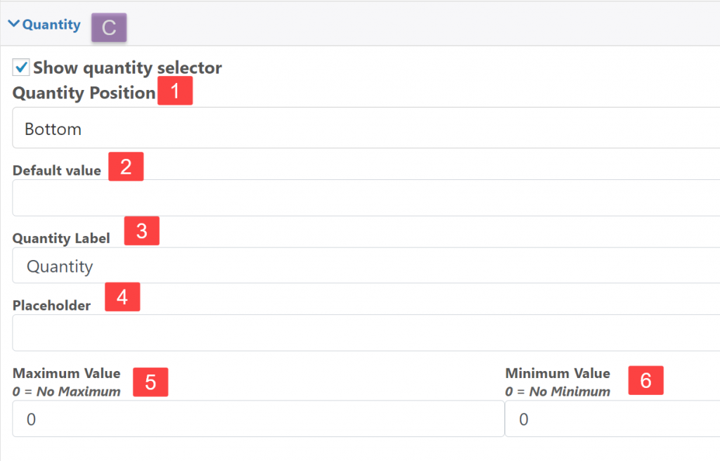
Show quantity selector: Display another input box to define the quantity used for the current field.
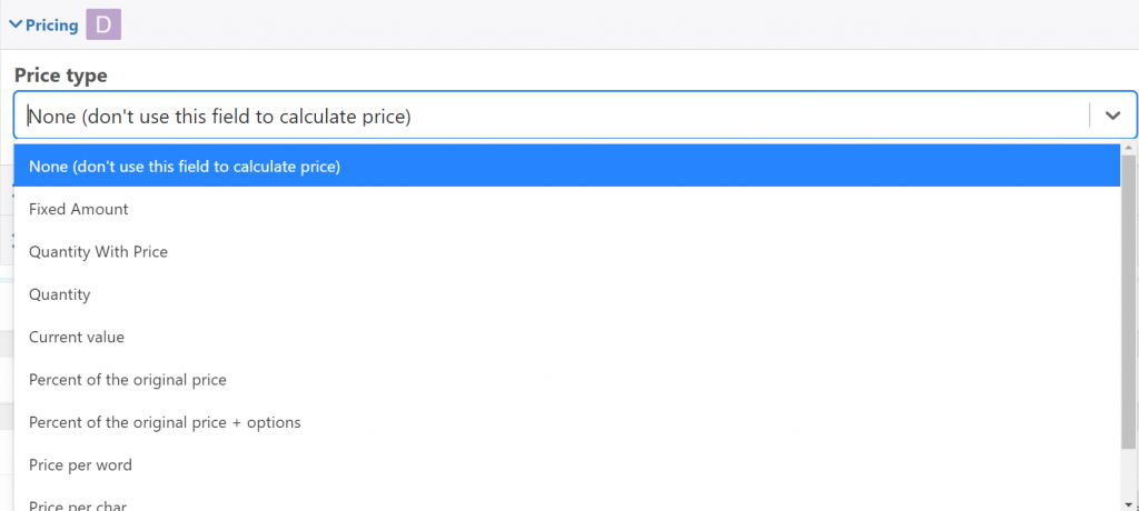
Pricing
Define the type of pricing that the field is going to use
Price: The price of the field
Sale Price: Sale price (if any)
Hide Price: Hide the current price of the field
Advanced
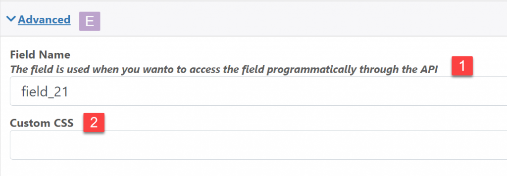
Field Name: The field name is used when you wan to access the field programmatically through the API
Custom CSS: Add a classname to the field that can be used to style it using CSS
Description (Full Version Only)
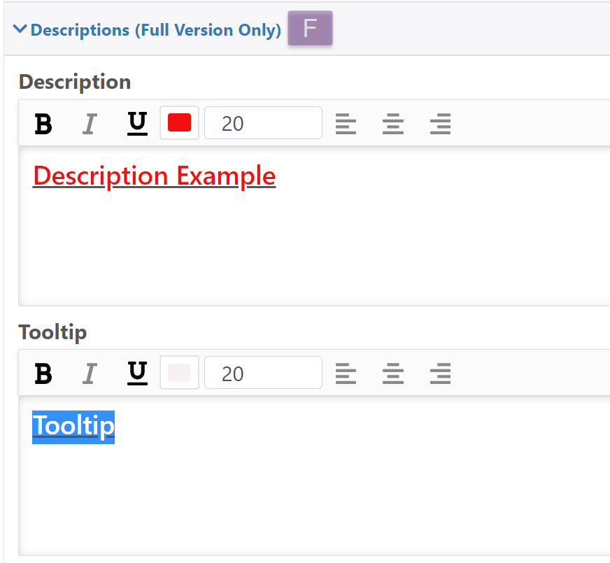
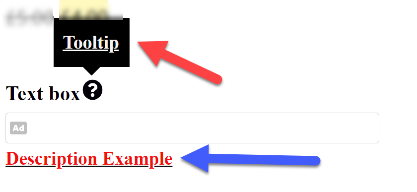
Descriptions: Description below the Text box
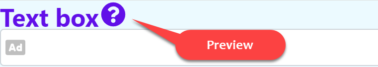
Tooltip: Add a symbol next to the name of the Text box where a descriptive text will appear
Conditions
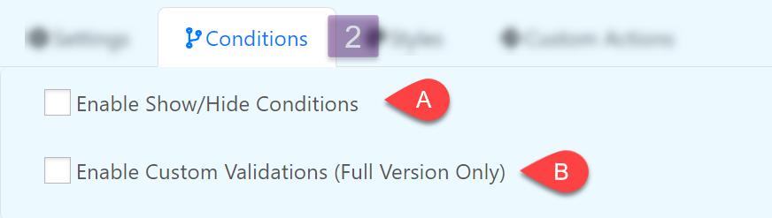
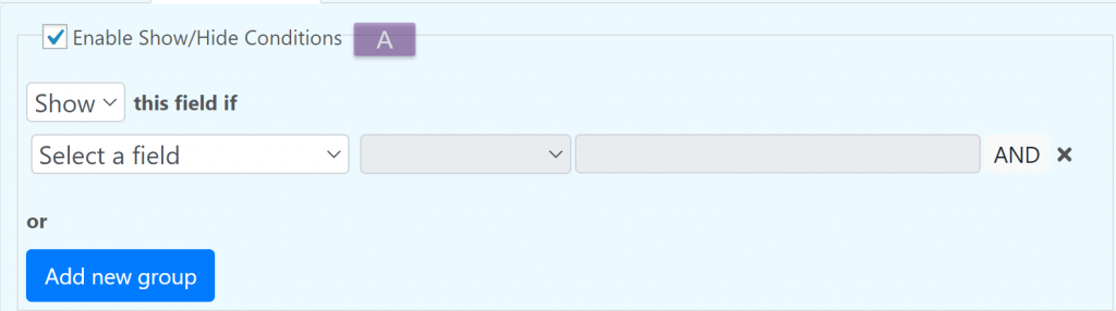
Enable Show/Hide Conditions
Enable Custom Validation (Full Version Only)
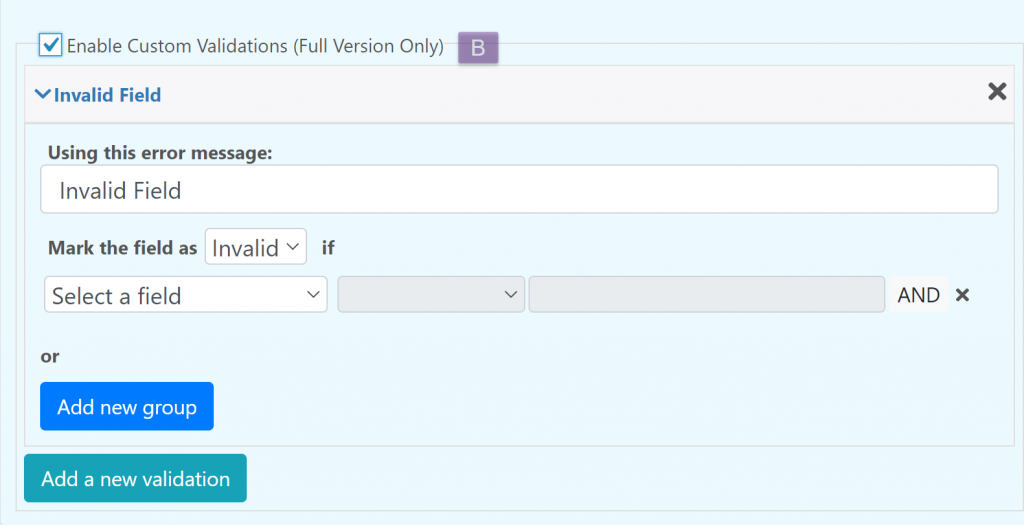
You can create custom validations for each field. When a field is not valid it can display a configurable text bellow it.
Styles
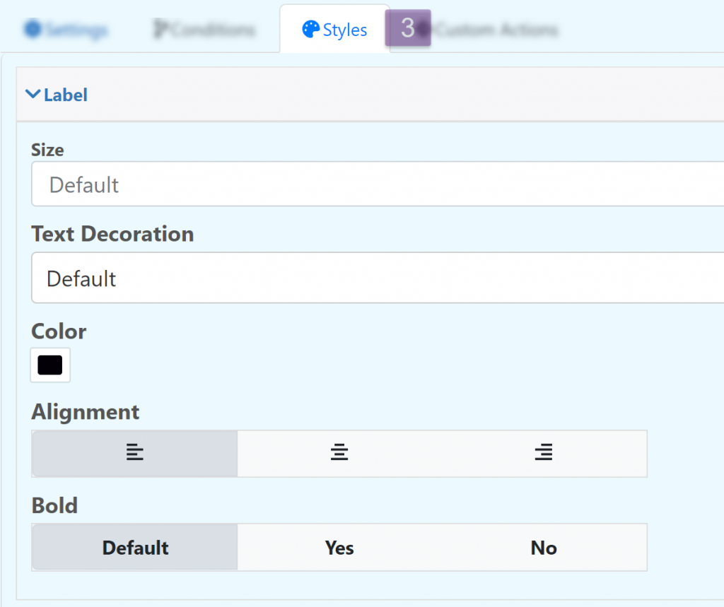
Edit the appearance of the field.
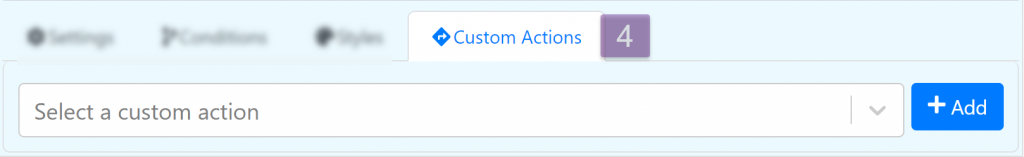
Custom Actions
Allow you to do advance configurations and actions with the field using JavaScript.