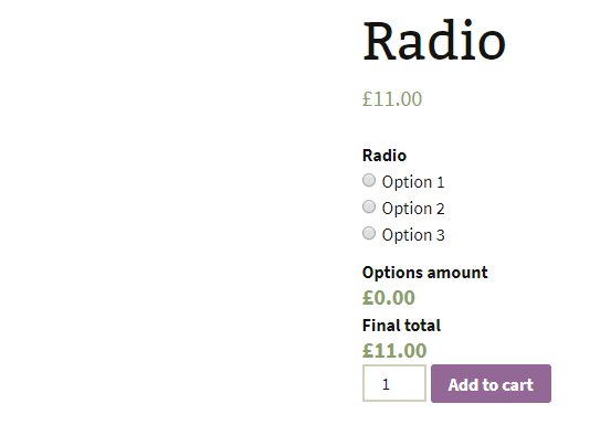
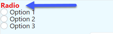
Add radio buttons to the product
Customize the drop-down menu according to your needs, add special conditions, styles and customize the field through javascrip.
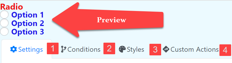
1.- Settings: General Settings
2.- Conditions: They are actions such as hiding the field or changing the price that are executed when a configurable criteria is met
3.- Styles: Edit the appearance of the field.
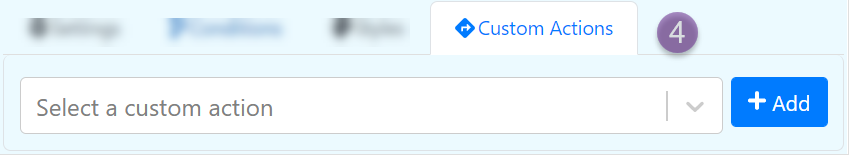
4.- Custom Actions: Allow you to do advance configurations and actions with the field using JavaScript.
1.- Settings
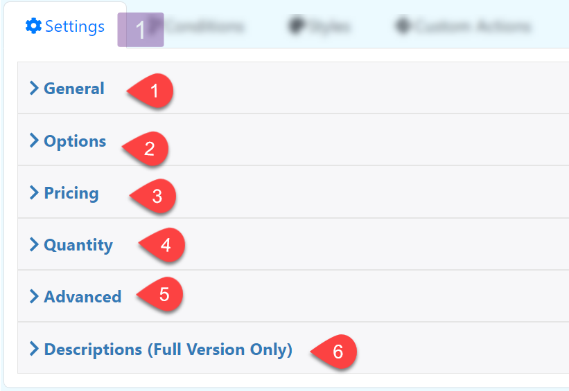
A.- General
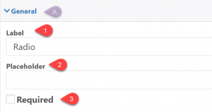
1.-Label: The text at the top of the input box
2.- Placeholder: Text inside the input box, this text is removed when the box is filled.
3.- Required: Make the field required
B.- Options
Add or remove options to the dropdown
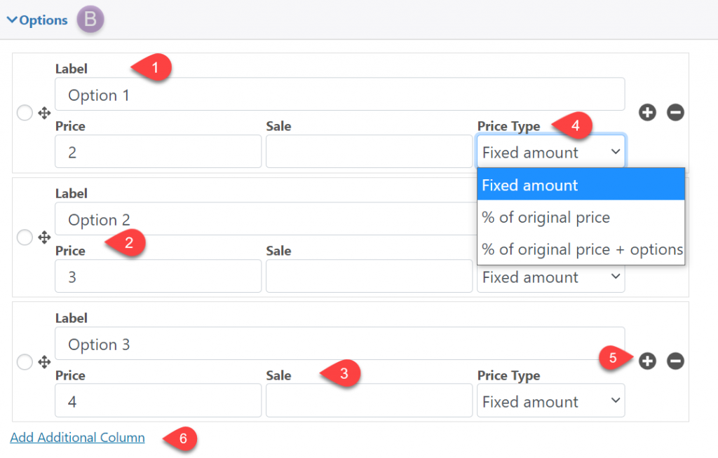
1.- Label: The text at the top of the input box
2.- Price: Define the option price
3.- Sale: Define the sale price
4.- Price Type: Add a price type; a fixed price, a percentage of the original price or the fixed price plus an additional percentage
5.- + – : Add or remove options
6.- Add Additional Column: Here you can add additional columns for each option, these columns can be used in formulas
C.- Pricing
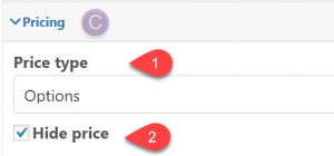
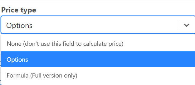
1.- Price type: Add the price of the option, or leave it empty, in the full version you can use your own formula.
2.- Hide price: Hide the current price of the field
D.- Quantity
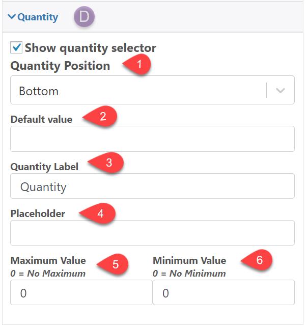
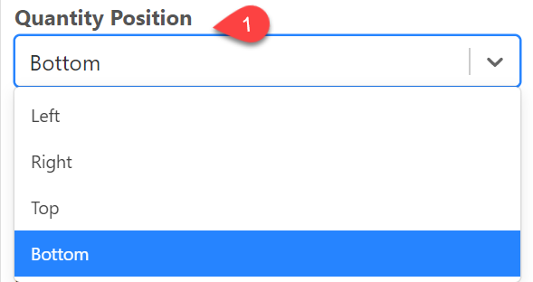
1.- Quantity Position: Define the position of the quantity field
2.- Default value: Edit the default quantity
3.- Quantity Label: Label for the quantity field
4.- Placeholder: Text that is shown when the quantity field is empty
5.- Maximum Value: Maximum quantity
6.- Minimum Value: Minimum quantity
E.- Advanced
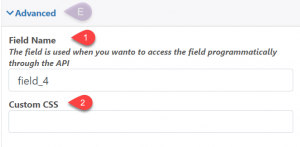
1.- Field Name: The field name is used when you wan to access the field programmatically through the API
2.- Custom CSS: Add a classname to the field that can be used to style it using CSS
F.- Description(Full Version Only)
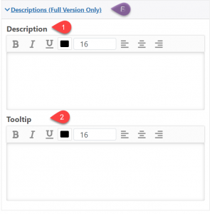
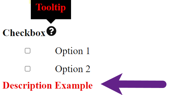
1.- Description: Description below the Checkbox.
2.- Tooltip: Add a symbol next to the name of the dropdown where a descriptive text will appear
2.- Condition
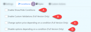
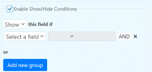
A.- Enable Show/Hide Conditions
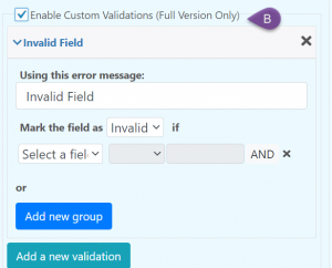
B.- Enable Custom Validations (Full Version)
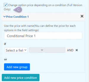
C.- Change option price depending on a condition (Full Version)
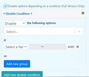
D.- Disable options depending on a condition (Full Version)
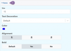
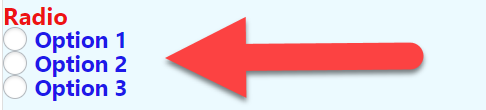
3.- Style
Edit the appearance of the field.
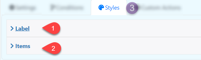
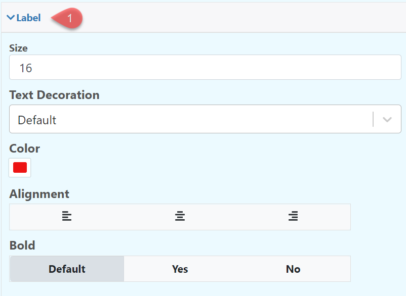
1.- Label: Modify the font type, color and position of the label
2.- Item: Modify the font type, color and position of the label
4.- Custom Actions