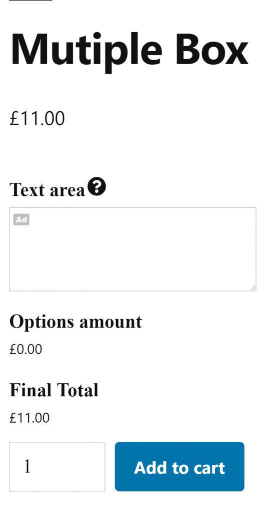
Add a multiple line box to the product
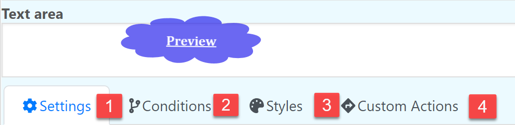
Settings
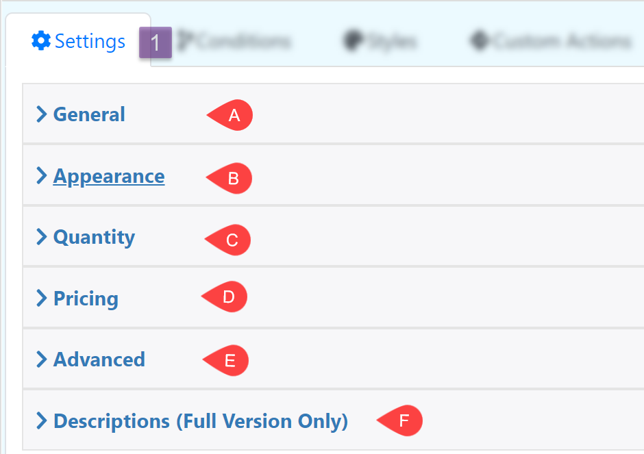
General
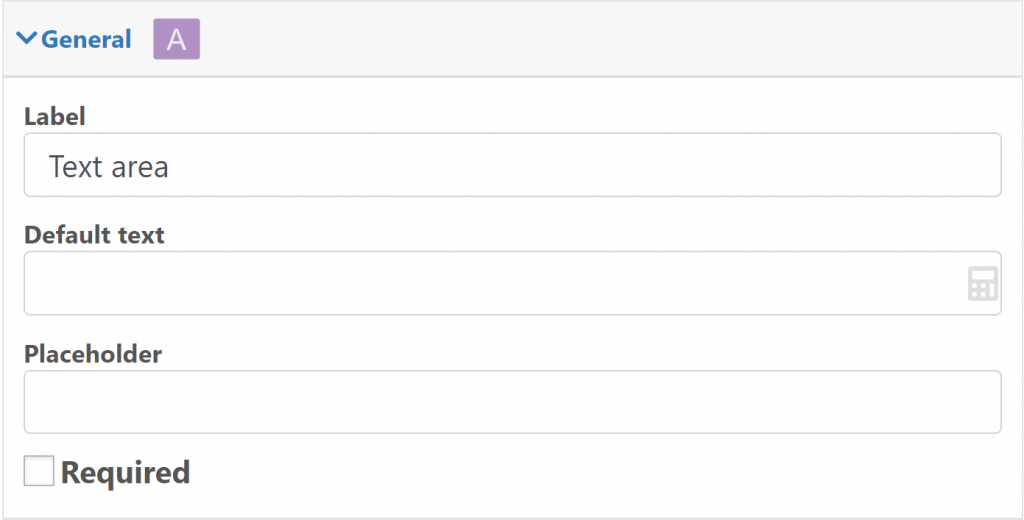
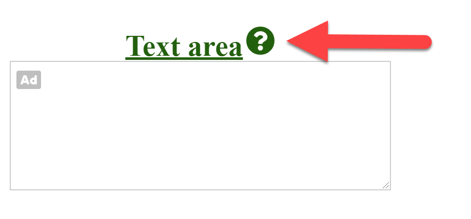
Label: The text at the top of the input box
Default text: Text inside the input box
Placeholder: Text inside the input box, this text is removed when the user use the input box.
Required: Make the field required
Quantity
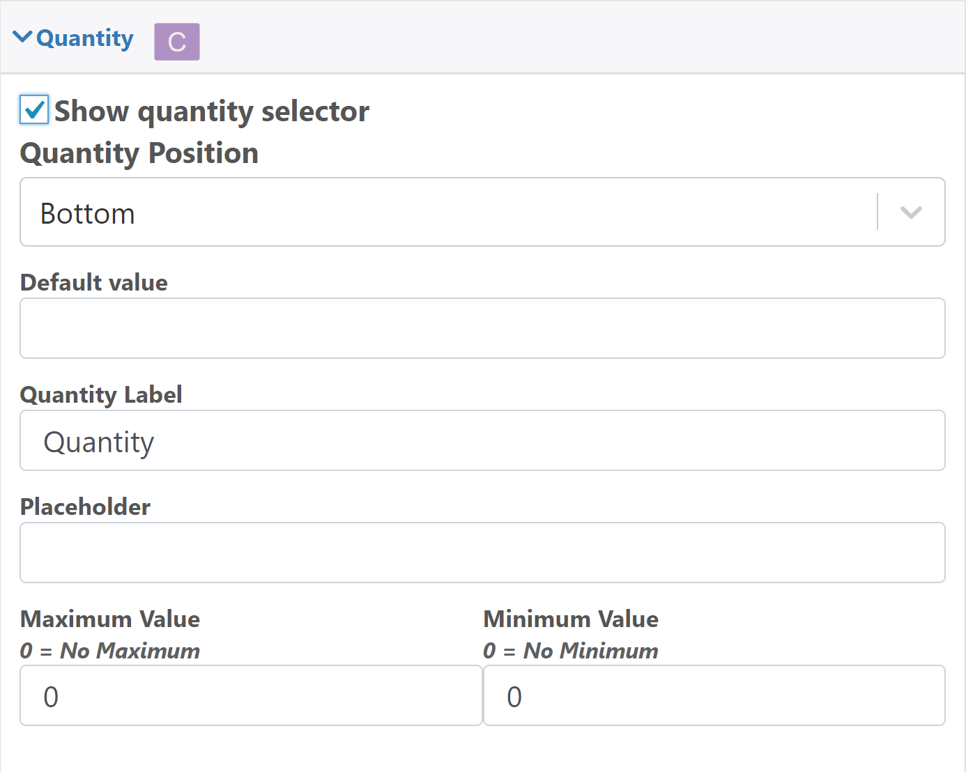
Show quantity selector: Display another input box to define the quantity used for the current field.
Default value: Edit the default quantity
Quantity Label: Label for the quantity field
Placeholder: Text that is shown when the quantity field is empty
Maximum Value: Maximum quantity
Minimum Value: Minimum quantity
Pricing
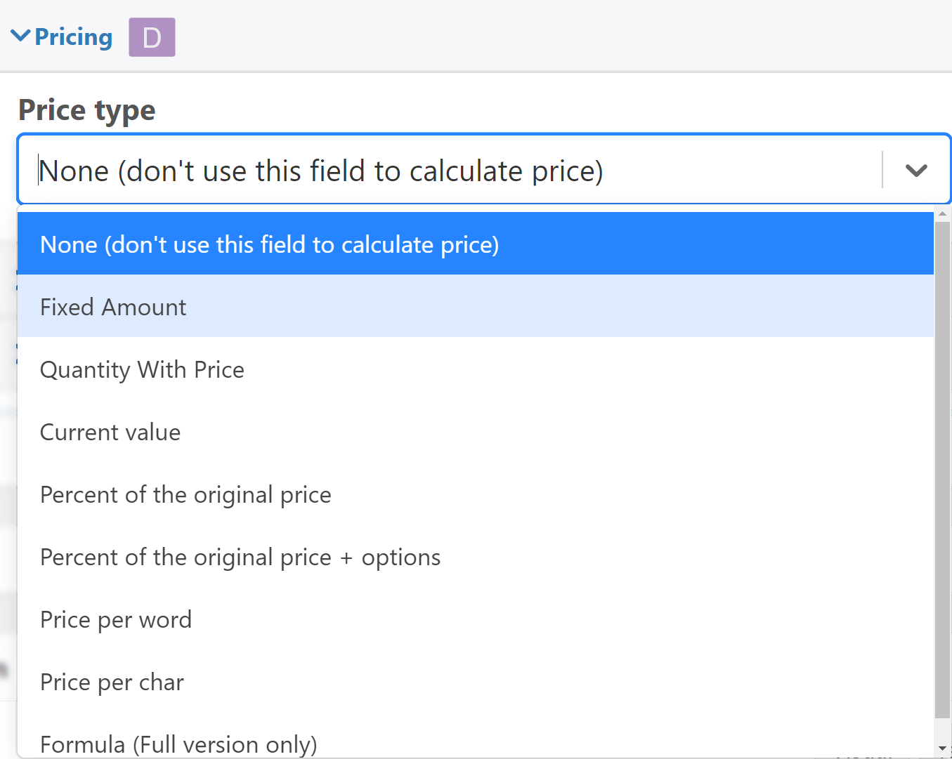
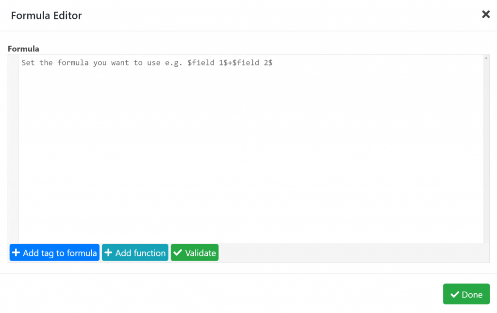
Price Type: Define the type of pricing that the field is going to use
Advanced
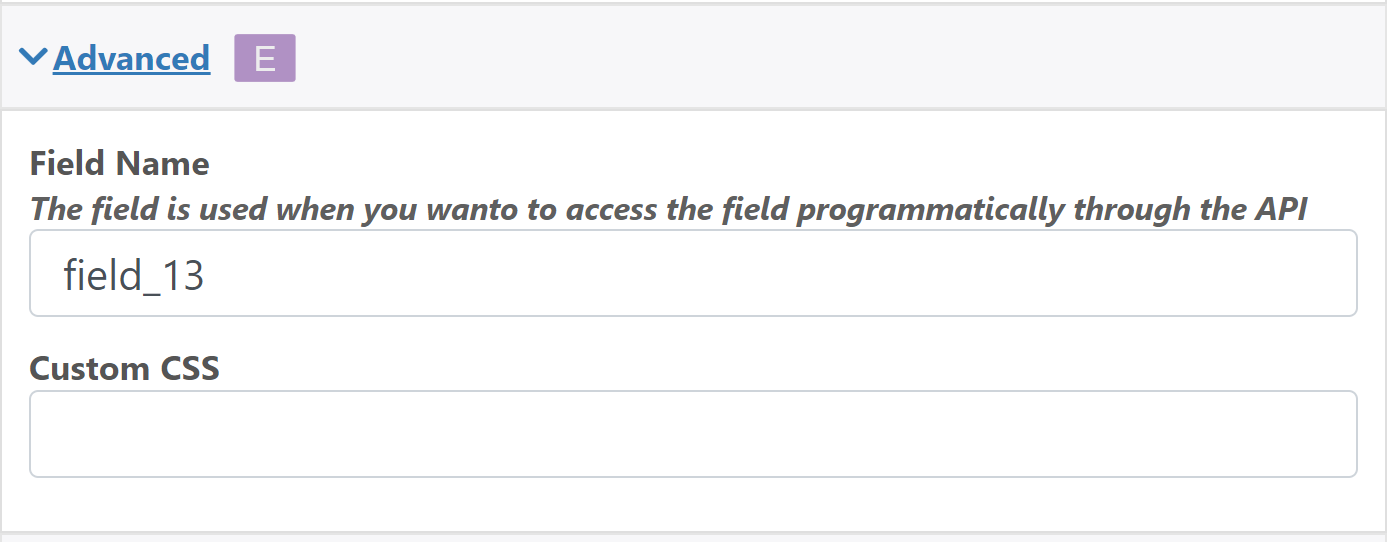
Field Name: The field name is used when you wanto to access the field programmatically through the API
Custom CSS: Add a classname to the field that can be used to style it using CSS
Descriptions (Full Version Only)
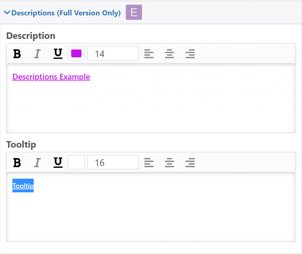
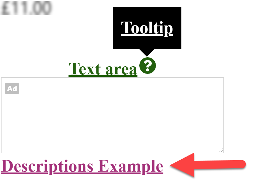
Descriptions: Description below the Button selection
Tooltip: Add a symbol next to the name of the dropdown where a descriptive text will appear
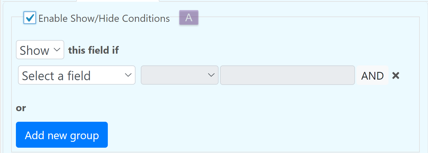
Conditions
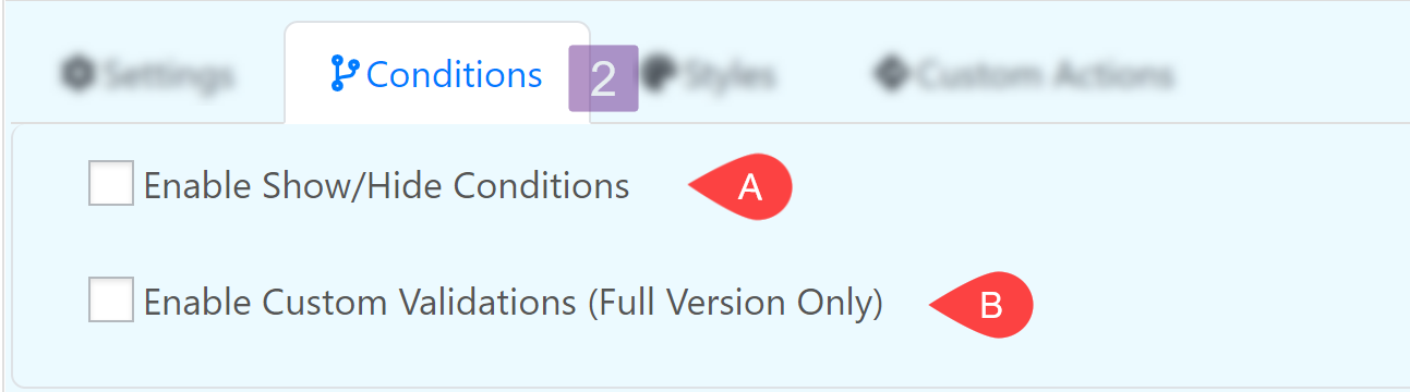
Enable Show/Hide Conditions
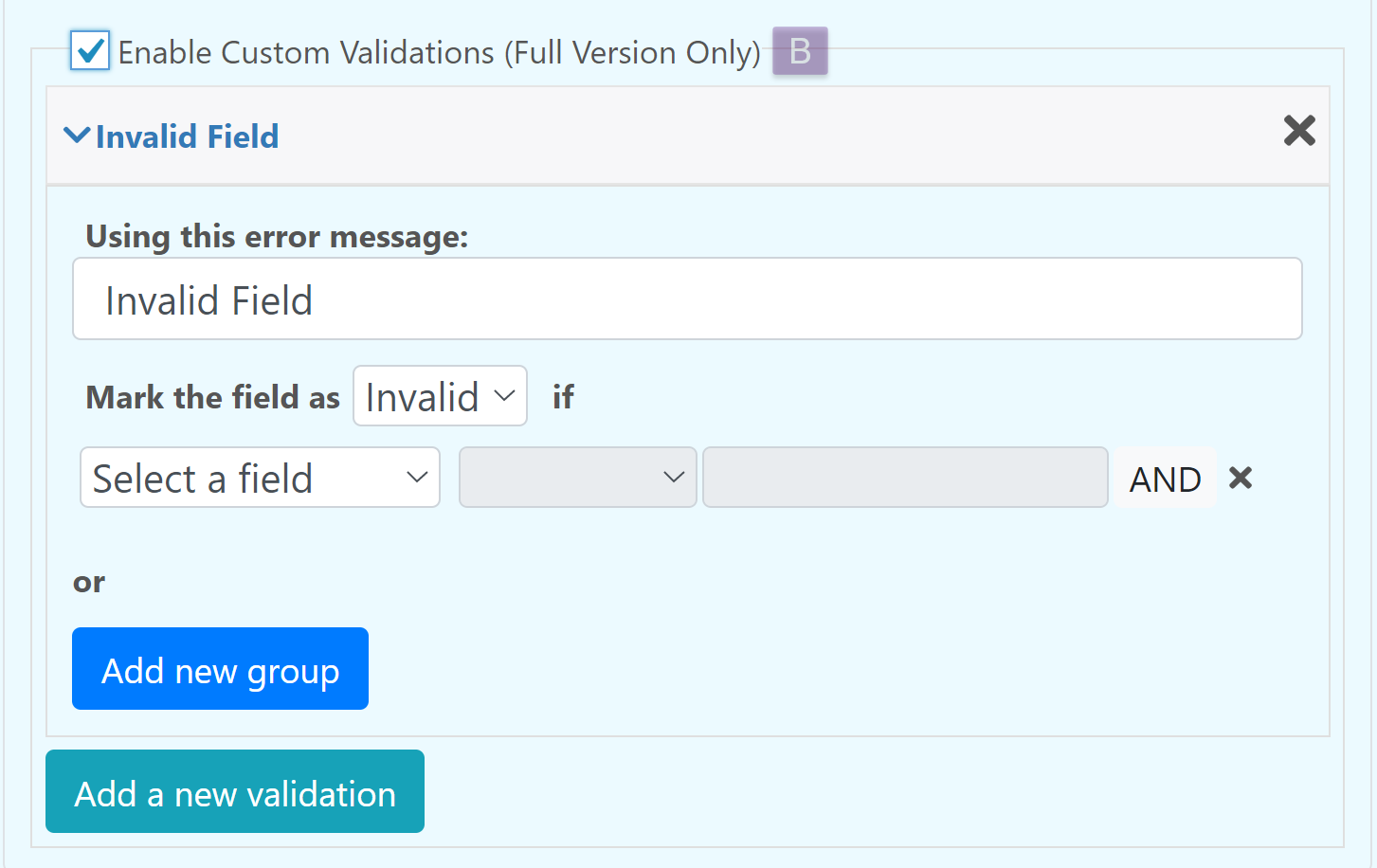
Enable Custom Validations (Full Version Only)
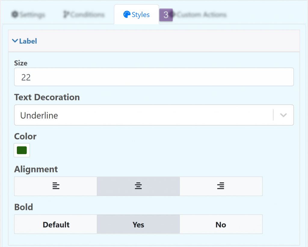
Styles
Edit the appearance of the field.
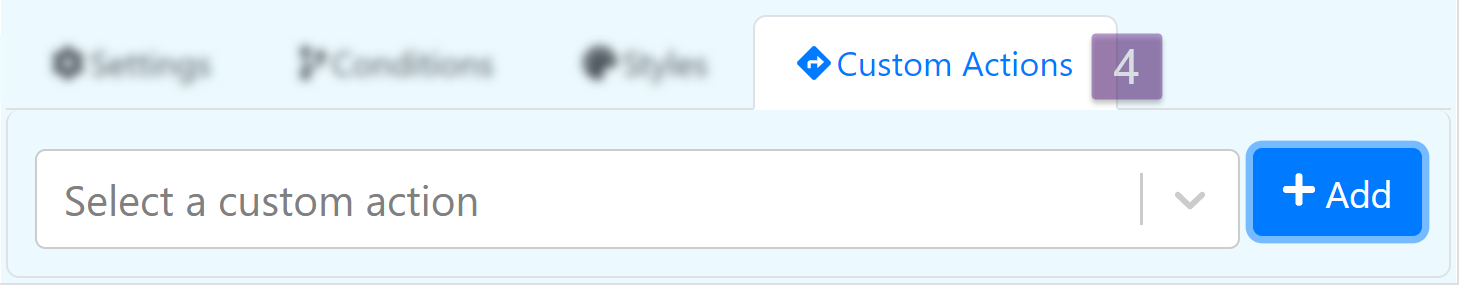
Custom Actions