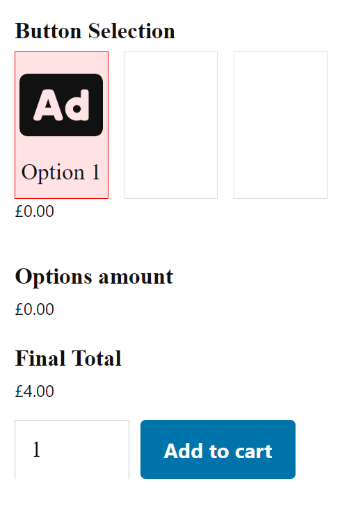
Add a Button Selection to the product
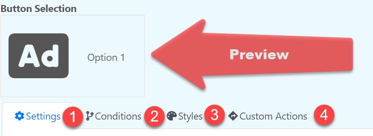
Settings
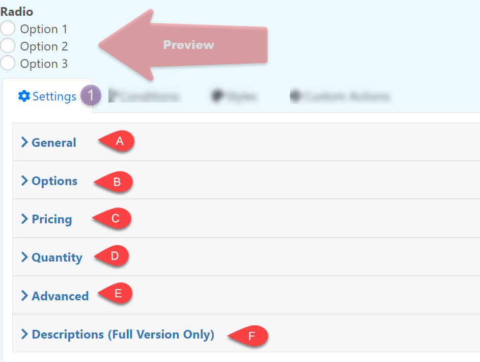
General
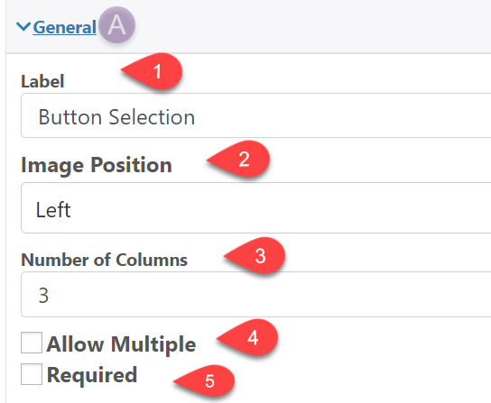
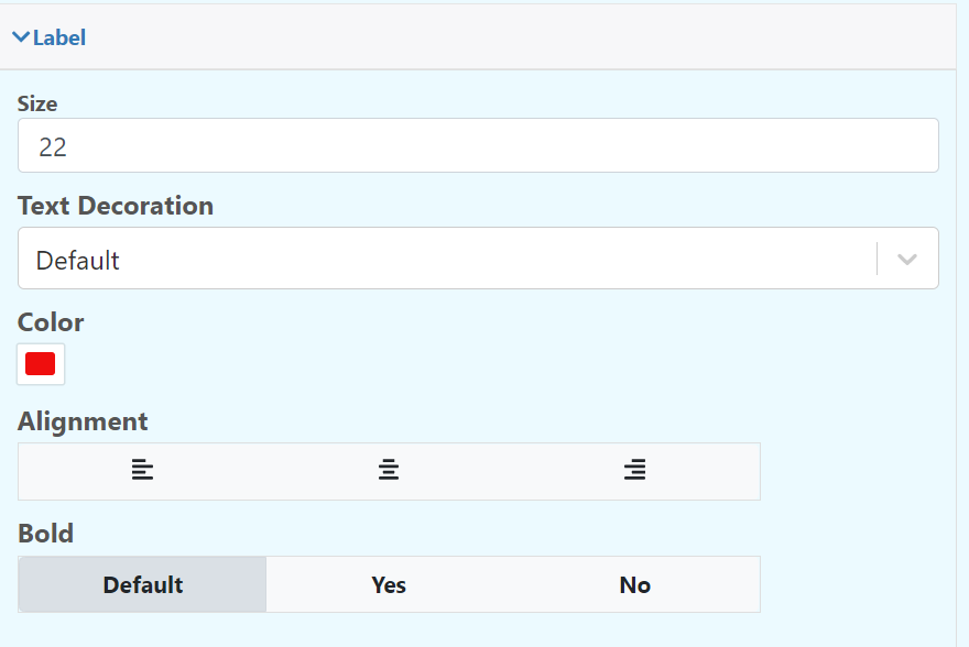
1.-Label: The text at the top of the input box
2.- Image Position: Add where you want the image to be displayed
3.- Number of Columns: Number of columns to create
4.- Allow Multiple: It gives you the option to select several buttons at the same time
5.- Required: Make the field required
Options
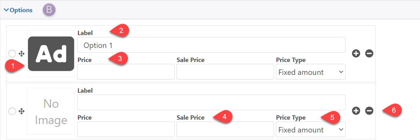
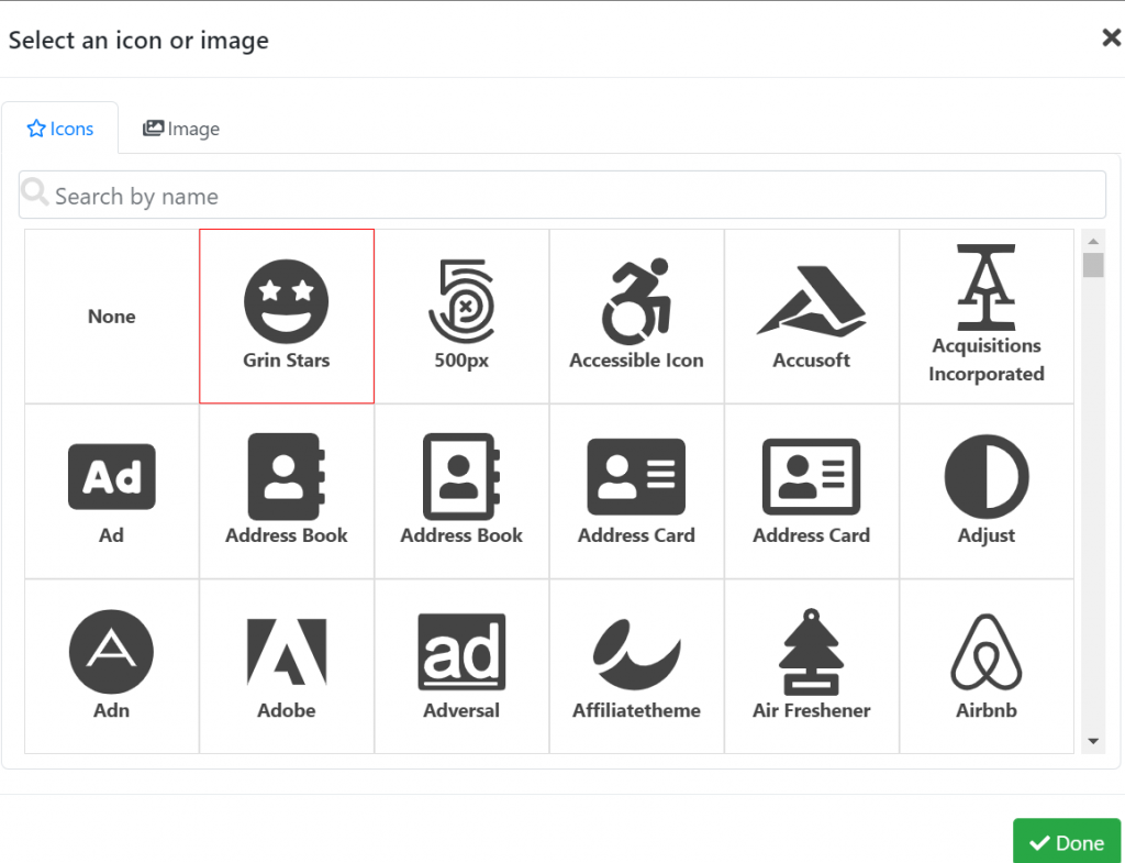
1.- Image: choose from a wide variety of icons or upload your own image from your gallery, this icon is displayed within the button selection
2.-Label: The button title
3.- Price: Define the option price
4.- Sale: Define the sale price
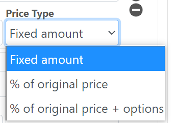
5.- Price Type: Add a price type; a fixed price, a percentage of the original price or the fixed price plus an additional percentage
6.- +/ – : Add or remove options
Pricing
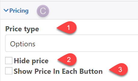
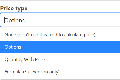
1.- Price type: Configure how the price of the field will be calculated
2.- Hide Price: Hide the current price of the field
3.- Show Price In Each Button
Quantity
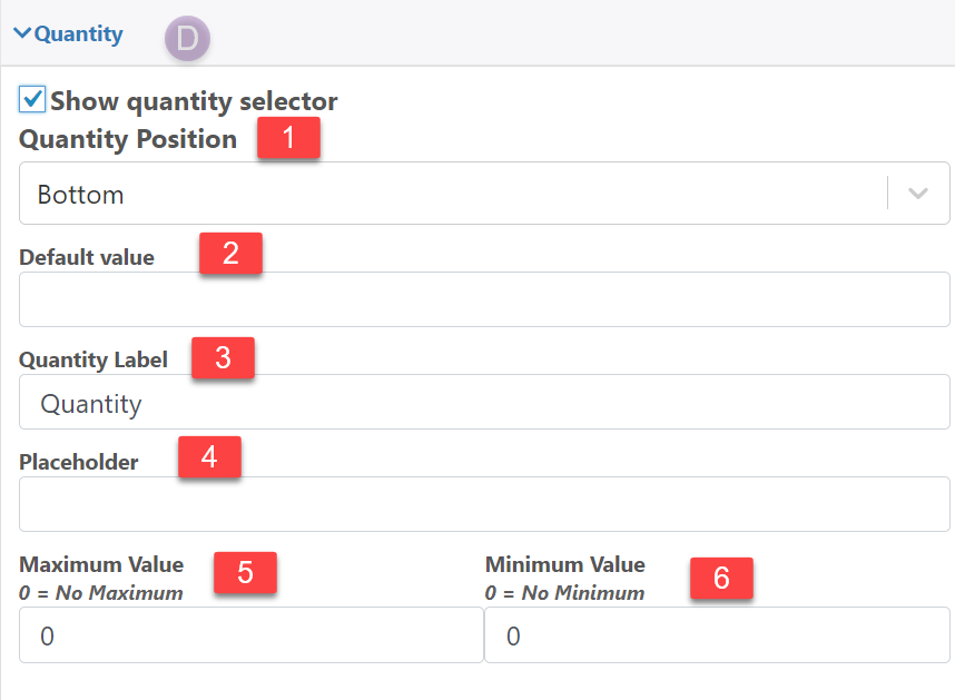
1.- Quantity Position: Define the position of the quantity field
2.- Default value: Edit the default quantity
3.- Quantity Label: Label for the quantity field
4.- Placeholder: Text that is shown when the quantity field is empty
5.- Maximum Value: Maximum quantity
6.- Minimum Value: Minimum quantity
Advanced
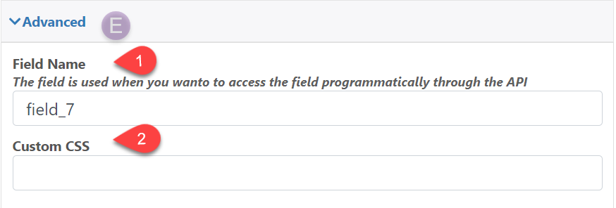
1.- Field Name: The field name is used when you wanto to access the field programmatically through the API
2.- Custom CSS: Add a classname to the field that can be used to style it using CSS
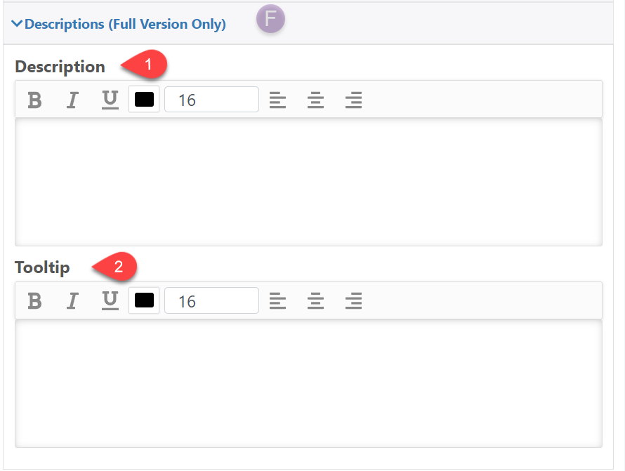
Description (Full Version Only)
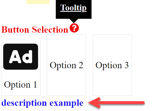
1.- Descriptions: Description below the Button selection
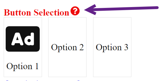
2.- Tooltip: Add a symbol next to the name of the button selection where a descriptive text will appear
Conditions
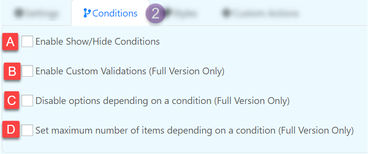
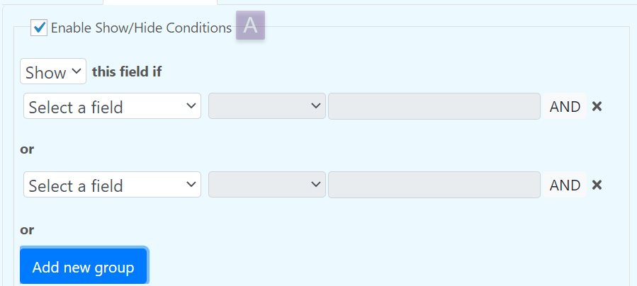
Enable Show/Hide Conditions
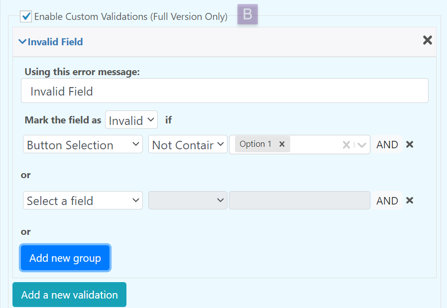
Enable Custom Validations (Full Version Only)
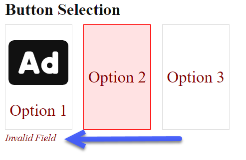
You can create custom validations for each field. When a field is not valid it can display a configurable text bellow it.
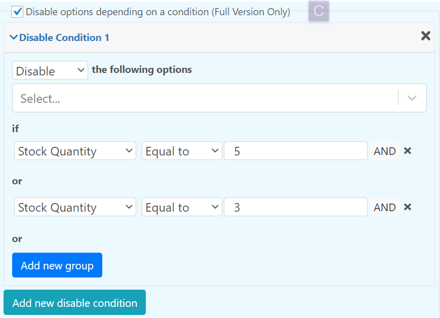
Disable Options depending on a condition (Full Version Only)
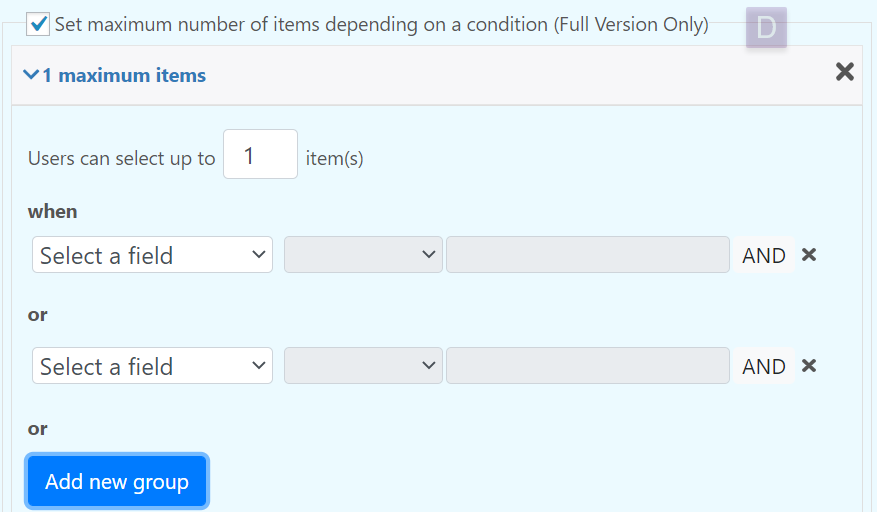
Set maximum number of items depending on a condition (Full Version Only)
Styles
Edit the appearance of the field.
Custom Actions

